By John Turney
 |
| Kevin Demoff, Rams COO, Had a habit of trolling Rams fans vis Twitter. Here he is wearing a hat with red it in the design, apparently for giggles. |
 |
| Steve McClard, Project Lead, Nike. Stated the team "got it right" |
 |
| Shandon Melvin, VP, Creative Director, NFL |
The reviews were mixed, to be generous. It's accurate to say that the creative team at Nike and the Rams and the NFL "didn't get it right the first time", at least according to the majority of the fans.
We've combed through a lot of fan comments and we think this summation is fair to what we've found online—Colors—A
Rams Royal and Sol. Taken together it literally means Sun King Ram
Primary Logo—F
Rams fans Panned it. (Pan is the Greek goat god—sorry, couldn't resist). The horn's spiral is derived from the Fibonacci sequence—paging Dr. Robert Langdon.
Additionally, according to an interview given to Rich Hammond of The Athletic, Rams COO said there was to be "grand debut throughout Los Angeles on the night of Saturday, March 21, to coincide with the start of Aries in the zodiac, which is the month of the ram." (Could this get more pagan?—maybe they need to page Tom Hanks to reprise his role in 'Dragnet'.)
Said Jack Youngblood via email, "Looks like the Chargers to me. That isn't us". Former longtime Rams Public Relations Director Rick Smith concurred on Twitter "Rams logo is soft. I don’t see any football toughness in it. Honestly, at first blush, I thought I was looking at a Chargers lightning bolt."There is even a Change.org petition asking Rams to reconsider. You can see it HERE. The goal for the petition is 5,000 signature. As of this posting they have nearly 4,000. Will Demoff take it seriously? Unknown.
Secondary Logo—B
Rams fans were more positive about this logo.
Though very quickly Twitter artists improved on it, according to many commentators. The top on increased the angle of the head and widened and colorized the eye and widened the cheek, the second added the wordmark and a mouth to the Ram head and is a deeper blue.
Wordmark—C
Logo lockup—F
 |
| crescent moon |
 |
| Side-by-side of new logo and Chargers logo, there is some resemblance |
The Ram horn is their brand, their identity. If anyone sees anything other than a horn then there is a problem. A big one.
So, five categories and we have an A, an F, a B, C, and F.
GPA—1.8 or a C-/D+
Walk Down Memory Lane
Here are past Rams logos, some not official, though they did appear on Rams stationary in 1937 (the red and black ones) and some were used on officially licensed Rams merchandise in the 1970s. The white Rams head logo (no gold horn) we are dubious of because it only appears in style guides in the black and white sections. And we never saw it after 1973 or so. We think the real logo was the Rams helmet with grey facemasks from 1974-80.
 |
| On 1937 Cleveland Rams official Stationary |
 |
| Also on the official 1937 Cleveland Rams stationary when the team colors were red and black |
 |
| Purported to be Rams logo from 1941-42 |
 |
| This Rams head logo is from the 1946 Rams Media Guide. It is less refined than the 1946-47 versions that appeared on game programs but enough alike to be considered the same we suppose. |
 |
| Though never documented, when used, this is what the logo looked like, which makes sense because the Rams colors were blue and white for a portion of the time this logo was said to be "official" |
 |
| Not official, but did appear on officially licensed merchandise in the early 1970s, sometimes offset with a light blue, perhaps to make it "pop" |
 |
| Again, not official, but did appear on licensed merchandise in 1973 and 1974. Perhaps in other years as well. It was used when Rams went back to blue and gold. |
 |
| We saw this more than the single-bar versions and always felt that this was the primary logo of the mid-to-late 1970s. It was on most of the pennants, jackets, t-shirts, etc., of that time frame. |
 |
| In 1981 the Rams changed the facemask to blue, but this is said to be the official logo from 1983-88 |
 |
| The official logo from 1989-94 |
 |
| The official logo from 1994-99 when Rams left Anaheim for St. Louis |
 |
| The new Ram head logo in "millennium blue and new century gold". 2000-2016 |
 |
| Same Rams head as in St/ Louis but in navy and white. 2017-2019 |
 |
| The new Ram head in Ram royal and Sol. 2020— |
 |
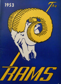
| As mentioned above, the long-time Rams head first made its appearance in 1948, not the early 1950s which is what the Rams PR department said in its release. |
 |
| 1953 Media Guide |
 |
| 1954 Rams Media Guide |
 |
| As mentioned the yellow-horned logo was used after 1970 when it was said to be defunct. |
 |
| One of the few places we've ever seen the white Rams head but as we mentioned it was blue, not black outlines. |
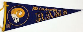
Felt pennants are also a way to gage what was used since in the early days it was like the Wild West, you could put any Ram on a pennant and "Los Angeles Rams" and sell it and, apparently, not get sued—
Then it became more uniform—
We also recommend you go HERE for even more pertinent info by SportsLogos.Net
Paul Lukas (Uniwatch.com) and Chris Creamer (SportsLogos.Net) are the home run kings of sports uniforms and logos.
Next up, what the Rams brain trust and Nike will do with the uniforms. Thee is no ETA for them.


I would prefer the secondary logo ... not really into a LA letters logo as much as this team has moved ...
ReplyDeletehowever you match the colors, the "real" Rams logo is the "Rams head" logo from the late 40s into the early 70s.....why oh why do these lame marketing people continue to meddle with greatness? the New York Yankees (baseball version) have had the same uniform and cap for closing in on 100 years.....when you get it "right", there's no reason to change....Fred Gehrke's helmet? inspired and with the slightest tinkering..."perfection".....this 21st century new thing? not so much.
ReplyDeleteoh....and you kids....stay off my lawn
ReplyDelete