By John Turney
Nike never learned that lesson. They foisted ugly uniforms on the NFL from the moment they got the chance. The first redesign they got to do was the 1997 Broncos. The fans didn't like it but winning the Super bowl changed their tune fast. The pants even had a slight Nike "swish" on them.
The rounded font was not too bad, at least it was not italics or something unnecessarily modern like that. And it went on from there. Nike was locked out of redesigning uniforms until 2012 (Reebock had an exclusive contract for many years) but in 2012 the Seahawks were rebranded. And they were, honestly, pretty good. The font was upright but they had nine iterations they could play in. And that didn't count the lime green color rush (another story for another time) but Nike had gotten their toes wet.
In 2013 was the Jaguars and the horrible two-toned helmet and equally horrible font for the Jaguars—
The had to be used for five years due to league rules, but were replaced by kits that were likely worse, if that's possible, again the numeral font the major culprit—
 |
| The newest Jaguars iteration |
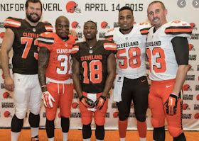
The Bucs and Browns unis were so bad they got rid of them as fast as they could. The Bucs went back to something close to what they had before. The Browns are yet to be revealed for 2020.
 |
| Bucs just got rid of these digital-clock numbers |
 |
| Nike got the drop shadow numerals wrong |
 |
| Silly wordmark on pants |
 |
| This font on numbers is terrible |
 |
| These new Falcons uniforms have been universally panned |
The media needs to secure interviews with the powers that be at the NFL creative offices where they are allowing such garbage on the field.
 |
| Dolphins fans were not pleased with the "belly-flopping" Dolphin logo |
The jury is out on the Rams and Browns uniforms, two teams with long traditions, and we will withhold judgment until they come out, of course, but if there are gradients, superfluous and frivolous fonts used just because they can then they will be fails. And Nike has had too many failures in the last eight years.
Frankly, it's time for the NFL to fire Nike and bring in a responsible athletic clothing company that will respect the traditions that made the NFL great in the eyes of most fans.


Reebok was just as bad ... I say let Mitchell and Ness and ebbetts.com design throwback jerseys that fans want ...
ReplyDeletethrowbacks! As much as I hate the IndyThieves, they more or less have the same unis as 1957....as do the Giants....Steelers (from the Chuck Noll era)….Bears....Packers....Raiders....."classsics" are classics for a reason....
ReplyDeleteGlad I'm a Steelers fan The Rooney's could not allow Nike to make any real changes to the Steelers uniforms
ReplyDeleteI missed the Reebok jerseys. Nike jerseys are too small.
ReplyDeleteNike Uniforms are just plain ugly!!!
ReplyDeleteAND the jerseys bunch up and get stuck in the shoulder pads! It looks like garbage! Don't get me started on the mesh pants!
ReplyDeleteNike is a garbage company. Their designs are trash. I’ve seen better designs by Kindergartners with finger paints. They also support the exploitation of women and children working in horrible conditions in their sweatshops. All of their products should be banned for sale worldwide.
ReplyDelete