
By John Turney
Goodness. The name—Commanders, is meh, but okay. The uniforms? Not as bad as the running of the Rams horn in 2020, nor the Jaguars disaster, nor others here.
Once again Nike tries to make "Fetch" happen with gradients. They stink on the Rams royal jerseys and the Atlanta Falcons black jerseys. The Jaguars helmet gradient was a fail.
Now, this:


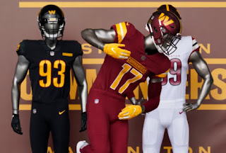
 |
| Washington Diamondbacks, err, Commanders road jersey |
The triple gradient. Gradients went in and out in the 1990s, mostly on NBA uniforms but Nike must think that gradients are cool and age going to con and forces them onto NFL fans like the push in the 1970s to get the United States on the metric system.
So note to Nike—Stop trying to make gradients happen
They are never going to work in the NFL no matter how much power you exert to make them happen.
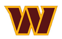
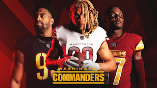
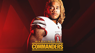
The Commander logo is pretty good, hard to find fault with a "W". 😃
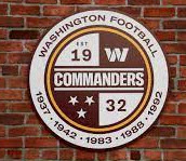
This logo looks good but has issues—
Update: Ken Gelman a very respected reader insisted that we comment on the error of the years the franchise won championships But, let's let him do it—
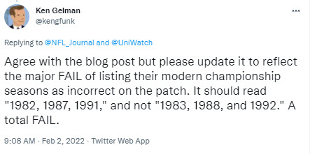
Clearly the championships years, for time and memorial, ate for the season played, even if the date of the Super Bowl was in the following year, i.e. 1982 would be the championship year, not 1983. The Commanders and whoever made this decision, as Mr. Gelman states, caused the logo to be "A total FAIL". We agree.
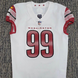
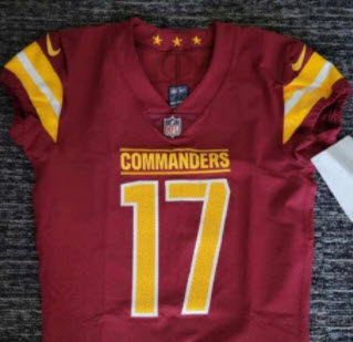
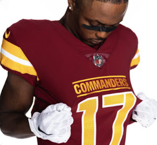
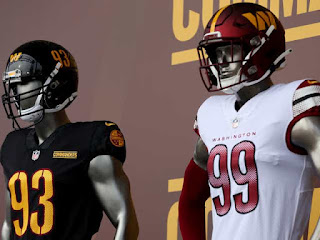
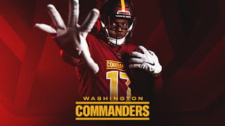
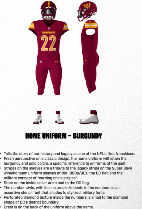
The red jersey is passable for an NFL uniform, but the number set is similar to the Dolphins and we think the numbers on this set could have been better.
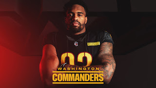
Paul Lukas, the all-time home run king of uniform media, coined the phrase "Black for Black's Sake" the Commanders have one of those BFBS jerseys as well. All we can say about that is it looks like a black uniform with yellow numerals. 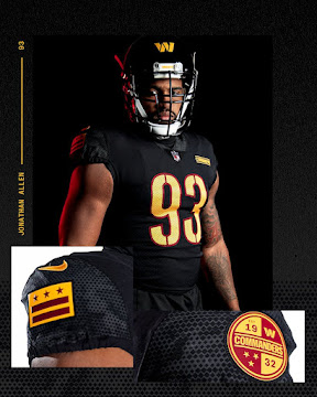
Up close you can see little features that Nike likes to "easter egg" for those who buy the jersey these features can make for conversation pieces, like Aunt Matilda's souvenir spoon collection or the shot glass collection from all the States on the sideboard (I didn't even know there was a sideboard) that conversation can only last so long.
Here are the Nikespeak explanations of the Easter eggs in the unis—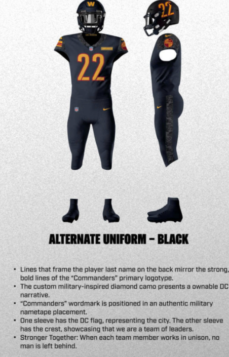

So, overall, we give a grade of D+ for this rebrand. Not as bad as Jacksonville in 2013 or the Browns in 2015 or the Rams in 2020 (the blue and gold colors were great) or the Bucs in 2014.
This feels more like a basic Nike failure, not a colossal one.
Remind me too much of the Minn Golden Gophers ...
ReplyDeleteThese uniforms are just so boring. I cant imagine Joe Jacoby or Ken Houston wearing these and liking it.
ReplyDeleteI agree, do not care for these or Nikes total influence in the NFL. Amazing that the team ownerships just let Nike design their uniforms and they go with it. With other teams, I feel like Nike is erasing the heritage of these teams for their own success. People who designed the old school uniforms really had great talent in terms of the logos but I get it.....it's all about money now and things be reimagined......which I hate that term
ReplyDelete