Showing posts with label Uniforms. Show all posts

Thursday, April 16, 2026

Ravens Add Uniforms and Tweak Old Ones

 By John Turney 
Much of the design of the Ravens' uniforms remained the same, with only the number trim tweaked while keeping the font the same. The basics of purple, black and white jerseys mixed with pants of the same three colors has been around, some of them since the beginning of the franchise, or agt least when the Browns moved to Baltimore in 1996 and changed their name and colors.

However, new helmets were added to the mix, a purple lid with gold facemask and a black on black alternate helmet with their alternate logo.

Apparently, they are calling the black-one-black "Darkness," with the all-black helmet to top it off.

Okay, fine. Whatever. 

Here, you can see the different trim on the numbers and little feathers around the collars of the purple, white and black jerseys—

And here is a shot where you can see one of the bigger differences, the pants striping. Let's just be grateful there is stiping, and this is workable, as part of the update/modernization. 


Our take is there is nothing wrong with these, nothing wrong with an update, but you kind of get this feeling when you see them: 

Per the Ravens, the purple over white and white over purple will be the usual and the secondary purple "Purple Rising" and the all-black "Darkness" will be the alternates.

As we said, nothing bad here, liked them before and like them now. The tweaks maybe update them a bit, so maybe take a B to a B+ or maybe a B+ to an A-, something like that. Maybe you think differently, but we'll see how much the mix-and-match and if they wear all 12 possible iterations. That will be the make-or-break for these kits. Some of them are very good. Others, well, not so good, yeah we are talking to you purple over black and black over purple!

Uniforms: Commanders -- Two Out of Three Ain't Bad

 By John Turney 


In the last couple of days, the Washington Commanders unveiled a new set of uniforms, two of which are patterned after the old Washington Redskins uniforms introduced in 1979 -- uniforms beloved by Washington fans.

And now they are back, sans the helmet. Plus a black over black kit with a similar logo, but with a spear through ti that has drawn some ire online, but in this day and age, you have to take the good with the bad.

At least the black uniform follows the same striping as the burgundy and white.

These are the old uniforms, the ones the franchise had great success wearing. As you can can see, except for the helmet, they are almost exact duplicates. 

So, the trend back to the middle continues. For a long time Nike went to extremes, with uniforms far outside the NFL mainstream and now the pendulum is swinging back. That is good for the aesthetics of football. No, it can never be the same; the design of the helmets and jerseys, how the sleeves are, the fit, all that does not allow for the same, exact thing to be had. But the trend gets these things as close as they can, given the circumstances and that's a good thing.

Grade: B+

Rams New Uniform Tweaks: And Upgrade

 By John Turney 

The Rams call the "bolder," but they just removed the nonsense. The wordmarks everywhere, the gradient numerals, the split horn shoulder stripe. All those things are better. The egregious horn on the helment, though, remains. 
Gone are the grey uniforms, the so-called "bone," and replaced by white pants and that, too, is an improvement. SO, no grey over grey, no grey over yellow and no grey over blue. Gone. All gone. 

Good.

The short horn was not going to change; they are just too committed to it, so that is life -- you can't have everything, but overall, these look like modern updates of the old Rams uniforms and that is a good thing. 

The bottom line is that these are an upgrade. Slowly but surely, the Nike design of the last decade and a half is being reverted to more classic looks or what amounts to modern versions of classic looks.

The Browns, Jaguars, Lions, Falcons, Commanders and now Rams, some of the worst things Nike did, are now all gone.

Good.

However, there is more. The Rams also posted that there are two more uniforms coming this summer. Speculation is that one will be a yellow jersey to celebrade the days of Crazylegs Hirsch, Tom Fears, Bob Waterfield, Norm Van Brocklin, Deacon Dan Towler, Tank Younger. 

We'll see.


Grade: B (pending the two new kits yet to be released)

Thursday, March 12, 2026

The Titans Back to Looking Like the Tennessee Oilers

 By John Turney 
Tennessee Titans new uniforms
The Tennessee Titans rolled out their 2026 uniforms on March 12, and right off the bat, it's clear the franchise is leaning hard into its Houston Oilers heritage. The new set brings back that classic "Luv Ya Blue" vibe with a heavy dose of Titans Blue (that familiar Columbia/light blue) as the primary jersey color, red trim popping where it should, and a cleaner, more retro feel overall. The light blue is "Titans blue" not Columbia Blue. A distinction without a difference.

The home look features light blue jerseys that instantly recall the Oilers' powder-blue classics from the Earl Campbell days—simple, bold, and timeless. They've ditched much of the recent Nike-inspired navy-heavy schemes for this brighter palette, a direct nod to the AFL/NFL era in Houston without fully copying the old derrick logo or exact striping (though the shoulder/yoke elements and red accents clearly show the Oilers influence). 

 The jerseys feature a new, "guitar string" inspired stripe pattern on the sleeves, a "TN" monogram on the collar, and three navy blue stars on the uniform. In our view, the stripe is too thin, even though we get Nike's desire to "connect" with local culture in the explanations, the design still has to work. As a design element, to us, it does not work. It will look like a fat light blue stripe. The red stripe will not be noticeable. Oh well.


The white helmet with a white face mask is also a bit of a disappointment. Red would have been much better. Just not a fan of white lids and white makes. Contrast is king, makes uniforms pop.

Pants stay straightforward having the same stripe design as the sleeves on both the light blue and white models. Heck, we're just happy they have stripes. The socks look to be solid, sans any striping. Not our favorite but par for the course these days. 
It's not a straight throwback; it embraces the Oilers DNA while planting the flag firmly in Tennessee. No overdesigned gimmicks, no unnecessary swooshes cluttering things up—just solid, nostalgic football aesthetics.

Pros: The light blue revival looks sharp on the field, captures the retro vide without feeling forced and mostly does not smack too much of Nike. They are the ones who seemed to have wrecked so many uniforms in the decades. Overall,  a big step up from some of the more muddled recent Titans looks.

Cons:  A few minor tweaks—like perhaps bolder numbers or helmet logo placement—could push it higher. Also the thin red stripe on sleeve falls short.

Overall, solid work. Grading it out: B.

Thursday, July 25, 2024

New York Jets To Wear Throwback Uniform in 2024

 By John Turney

Jets' throwback uniform that was announced this week

Starting in 1964 the New York Jets donned their green and white uniforms with the shoulder stripe and two sleeve stripes. The white version was worn in Super Bowl III when the Jets defeated the Colts 16-7.

They wore those through 1977. In 1978 they wore green helmets and jerseys with twin stripes. 

This year they will wear both. 


They will have the same design but the color is what they are calling "Legacy green" as opposed to the old Hunter green.

Here is a graphic from the change of uniforms from earlier this year—

This week the throwback or "Legacy" design was announced as an alternate uniform. Ironically the "Legacy" last year became the usual this year going forward.

So, it's the best of both worlds. And the good part is that the Nike-designed uniforms are gone— hopefully forever.

This jump back to the past is a further indictment of Nike's failed designs. A couple of teams -- the Bucs and Browns went back to nearly identical uniforms they wore before Nike hijacked their uniforms. Now the Jets join them.

Others like the Jaguars and Lions went to a more classic look, though not the same as before. Although the Jaguars announced a throwback earlier this month.

It will be interesting to see if the Rams and/or Falcons also revert when they can—which the Rams can next year. We are not hopeful on that front. We'll see.

Thursday, July 18, 2024

Jacksonville Jaguars Announce 'Prowler Throwbacks'

By John Turney


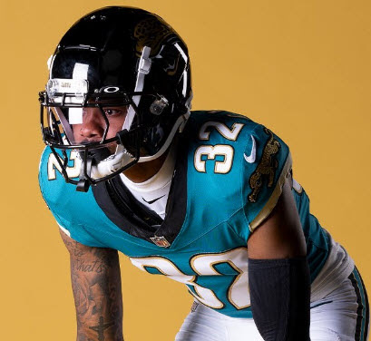
The club calls them "Prowler Throwbacks." and are supposedly based on the  According to the team they are based original 1995 expansion uniforms.

Well, they are close. They are based more on 1998 than 1995. In 1997 they changed the numbers but added black underarm panel and in 1998 they got it right by eliminating that. 


The first couple of years the uniforms had block numerals—


The 1997 rounded numerals and black panel jersey—


Then they settled on this in 1998 and this is what Jags have chosen as thee 1995 Throwback. 

No, they are not from 1995-96 or even 1997 but no matter, the ones from 1998 and after they debuted today are great—

Side note, click here for a good story about the 1997 preseason font by Paul Lukas, the home run king of sports uniforms.

He explains the problem with legibility for the changed number set and the change to what they replaced them with, which is what was the font they used today.


The Jags also brought back their original logo—

There is not much difference ... but might as well make the look complete, rather than mix and match throwback uniforms with the newer logo.


Regardless, there isn't a lot to say -- The Jags get an "A" for these. Goes to show classics almost always look great and these are no exception.

Well done.


Thursday, July 11, 2024

Washington Commanders Add Gold Pants

 By John Turney 

This week the Washington Commanders have added gold pants to their uniform kits. 
Thank goodness. 

Previously they had white and burgundy that could be matched with the white and burgundy (red) jerseys—

Okay, not great unis -- one issue is no stripes on any of them -- but if they used just what is show then it would be the best they could do. The problem is when they matched the red with white pants it didn't work.
If you want numerals other than white you need them to match the pants (with the non-monochrome option). It lacks balance ... 

They corrected it so the red over white may be over. Of course, they could still do it but with the gold option the pants match the numerals and make them pop. It also adds balance to the design concept.

It is not as top-heavy as they are with the white pants. 
Still not in love with the uniform set but they did fix one of the problems. Adding stripes to the pants would have been even better -- but we'll take one step at a time.

Thursday, June 6, 2024

Another Alternate Uniform — Another 'Meh' Grade: Vikings

 By John Turney

Today the Minnesota Vikings announced their "Winter Warrior" uniforms -- following the trend of white helmets and uniforms  -- kind of the opposite of the alternate black uniforms some teams were donning in the fairly recent past.

These are just okay. Call them a C-. It's the same striping and similar, though not exact, numeral set as their usual uniforms but with the accent color now silver rather than gold/yellow.

The numerals lack the "sail" which is one the second number of two-digit numbers. These are clean -- and have a silver outline. But the font appears to be the same.

If you are into the "icy" look, you'll like them. If you are not in the white for white's sake thing, you'll think they are bland. And the single silver stripe down the middle of the helmet ... why? It's odd.

One thing is fur sure, a lof of folks at Nike have forgotten that contrast is a design element. Here, only the purple numbers will be visible from the stands. Fans will not be able to see the Viking horn on the helmet unless they are very close to the field. Same thing for even HD television. It will mostly look like a white helmet with no design.

To us, this is an average uniform as it is and the white makes it worse. 

Some shots—


Thursday, May 16, 2024

New York Giants Reveal 'Century Red' Alternate Uniforms

 By John Turney 
Today the New York Giants revealed their "Century Red' throwback/alternate uniforms and they are interesting as well as terrific. They are not 100 percent historically accurate but that can be forgiven.

They took the 1938 helmets with wings that are based on the contours of leather helmets of the time. It's the Michigan look, more or less.

They matched the 1925 socks with the 1933 Jersey and that pair works because they match very closely. 

Here are the shots released by the Giants—

Here are a couple of colorized shots of the 1933 jerseys—
Bo Molenda (23), Dale Barnett (18), Ken Strong (50) and Harry Newman (12)
 

Harry Newman

Mel Hein in the 1938 winged helmet
Mel Hein

A shot of the 1925 socks (colorized)—

From what we can tell the reaction is mixed. Some Tweets (now X) are mocking them and some seem to enjoy them. 

For those who like them, the complaint is the tan pants, preferring that they be white. 

To each is own, but it's a good effort, in our opinion. Well done.

Monday, April 22, 2024

Broncos Roll Out Some New and Some Old Looks With New Uniforms

 By John Turney
The Denver Broncos released their new uniforms and a classic uniform today. The Broncos, if you recall were the first to go with Nike designs and in 1997 began the "navy" blue era, changing the blue to a darker shade. 


Shots from the 1997 reveal 
There were mixed feelings at the time and today it's the same. Online there are some who say they are "fire", but seems like a lot of opposition as well "garbage"— so again, mixed results just like 1997.

First, the easy part. T
he throwbacks patterned after the 1977 Super Bowl uniforms are excellent. Could not have done it any better. Give them a "A" because they hit all the notes, clean classic.

Well done.

The throwbacks, the "classics"

The rest? Hard to say. They don't fail like many of the Nike concepts but they have all the silly components that Nike likes to say "inspired" then look so, it's a case of somethings are decent. Some things are over the top.
The colors are the same as before -- navy, orange and white, of course, but the names are tarted up. They are calling the the orange "sunset orange" for example. The white is "summit white". Okay fine. The the navy is "midnight navy" from the department of redundancy department.

The mountains on the sleeves and the "5280" all over everything (overdone) are pretty gimmicky but subtle enough that they won't show too much on television and photos. 

There are three jerseys, three pants and two helmets and creates a mile high pile of combinations—

The helmets were switched to a matte finish, away from the glossy one, and have an odd decal composed of tiny triangles that form an arrow in the back and have a "5280" on the front bumper.

The decals are supposed to represent a climb upward. 


The alternate "snowcap" helmet -- "summit white"

In a statement, Broncos president Damani Leech said,

"It was great to hear from the Nike folks, from a pure design standpoint, them talking about what it felt like in 1997 — or from the ones that weren’t there, how they study uniform history and how it felt like in 1997 was incredibly innovative. We still want to do that. We wanted to move the aesthetic forward, move the game forward. And we wanted expansion. We want this to be something that a new, young, diverse fanbase can say, wow, that’s amazing. I want to be a part of that from a fan standpoint and I want to wear that from an apparel standpoint."

Apparently, the team wanted the whole uniform set to reflect Colorado's mountains and it is all over the uniforms.  The "snowcapped" white helmets introduced last year foreshadowed it, we suppose.


The Broncos are in a mountain motif for at least the next five years. 

So, the throwbacks are an "A" and the rest is a "B-". The design is just Nike trying to show off but the whole thing is saved because navy, orange and white are a good color combination.

Here are some closeups of the uniform "narrative" if you are into that kind of thing—