
By John Turney
 |
| Chargers.com |
Since Nike took over as the only uniform provider to the NFL in 2012 there had only been ten uniform changes in total (Jacksonville had two of them). Of the seven this year two are also included in the previous ten.
In these seven or six if you will, Cleveland, Tampa Bay, and the Los Angeles Chargers are reverts to former uniforms so the Nike influence is minimal on those. The Patriots are simply a change from their familiar uniforms to what had been their color rush uniforms and then they added a white road jersey. Only the Rams and Falcons allowed the Nikefication of their uniforms, and it showed.
So, we will give overall grades for each, with individual grades on each iteration shown in each team's release photos.
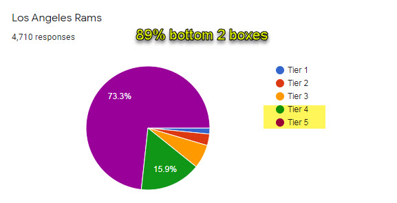
Here is the LINK to the polls cited—NFL Jersey Tier Rankings, 4,710 responses
Overall grade = B

Buccaneers Owner/Co-Chairman Ed Glazer stated: "This new but familiar look is a direct result of the valuable feedback we received from our fans. We are excited to return to our classic Super Bowl era uniforms while also introducing a sleek Color Rush uniform that showcases our signature pewter in a new and dramatic way. The refreshed classic design of our home and away combinations bridges our past with our exciting new future, and we are confident it will resonate with our fans."

Overall grade = D

If the Falcons wear the block over white and white over white and black over black and the throwbacks and never wear the gradient or the white over red or white over black the grade would go up to a B-.
Said the Falcons, "Like the city of Atlanta, black evokes strength, power, grit … and a little bit of swagger. Black jerseys have been a part of Falcons history since they first took the field in 1966, during the original Dirty Bird era in the late 1990s, from 2003-08 and more recently as alternates or throwbacks. The color red reflects a shared sense of community in Atlanta as most of the major sports teams and many iconic homegrown brands share the color."
Further, "Atlanta is known as much for diversity and culture as it is for innovation and creativity. From music and design to business and technology, the city of Atlanta influences everything. The Falcons have a proud tradition of bringing people together from all walks of life, so the new ATL mark is placed proudly and prominently across the chest of the new uniforms as a reflection of a city constantly on the rise."
Matt Ryan said, "There's just a feeling to it. I can't explain it when you look in your locker and that color and head to toe in black is going to be good, too. I don't know what it is, but I know there's a feeling that comes with it for the guys, too, when we see that in our lockers."
Grady Jarrett added, "I think these new uniforms will give us, give the city a new energy and I think people are going to really be excited about it. We know this is a tough time for everyone right now, but we hope this can bring some excitement and light to our city and our fans. Around the whole world, everybody knows what ATL stands for, so we're proud to represent that, today and every day."
" Just letting them know exactly what we're playing for, the city we're playing for. There are a lot of people in this city that ride for the Falcons, and we want to let them know that we're riding for them, also. I like that." Deion Jones added.
The Falcons helmet has evolved from a traditional glossy look to a more modern all-black satin finish


After the debacle a five years ago the Browns Executive Vice President and Owner JW Johnson said, "We wanted to get back to the roots of who the Browns are. We've heard it from our fans and from our players. We needed to get back to our roots."
"As you look at iconic franchises like the Browns, the Bears, the Packers, the Cowboys — they're true to who they are. They're not doing a lot of changes and trying to make a lot of flashy moves with their uniforms. I think when we went through the process, it just felt right that we got back to who we are and who we'll always be."
He is right. What they did before stank. This is the right directon.


The Colts also made some changes in their wordmarks and added a secondary logo, all of which was well and good. But the main thing was the excellent change in the numerals. Well done, Colts.

Overall grade = B


Overall grade = A

Said the Chargers, "We evolved it, simplified it, took what YOU loved about it, and made it even better. Drawing inspiration from California in the 1960s, we set up shop with Nike and the NFL to modify a classic. Staying true to Powder Blue and Sunshine Gold we set out to do just that with a bold, vibrant, and electric update that pays tribute to our AFL roots."


The best thing the Patriots could do is to lose that gawd awful logo they have on the helmets and go back to "Patriot Pat"!
ReplyDeleteclearly the fan preference, especially for the older franchises is back to the traditional look.....Cleveland looks great....like they could play for the 64 and 65 title games....Keith Lincoln and Earl Faison would love to darn that lovely blue with the great numbered helmets...classic!....i will never approve of the "Indy" franchise, but the numerals resemble the jerseys on the Colts of another place and time (circa-1957/8/9)....hey Nike....why don't you go change the Yankees baseball unis? they haven't changed in almost 100 years for a REASON
ReplyDelete